Typography trend in S/S 2014 collections
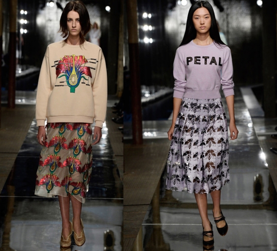
Our fondness for all things typographic, here at Trésor, is no secret, so you can imagine the excitement when we saw that the typography trend continued to evolve and feature ever more prominently in the 2014 Spring/Summer collections in many shapes and forms: statements, slogans, logos, hand-written letters etc.
Alexander Wang — translating the bold block letters of his logo into laser-cut leather and digital printing (above)
Christopher Kane — text-book style illustrations combined with graphic arrows and bold Helvetica Neue caps.
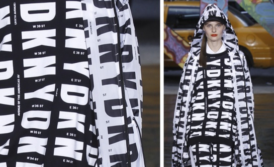
Donna Karan – pays homage to New York. ‘We chose this font because it mimics the tall, skinny silhouettes of New York City skyscrapers and the graphic intersections of the city streets,’ explains Jane Chung, DKNY’s executive vice president of design. (image credit: Wallpaper*)
Céline — combines the work of Hungarian photographer Brassaï – photographs of wall-carvings and graffiti captured in Paris in the 1920s with modern micro-formatted newsprint.
(images: style.com)


